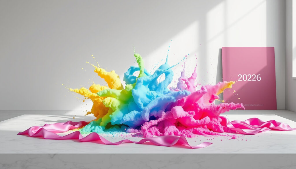
Color of the Year 2026 – Everything You Need To Know
The Pantone Color Institute has revealed its 2026 selection: PANTONE 11-4201 Cloud Dancer, a billowy, balanced white marking the first time this hue has been chosen since the program’s inception in 1999. The announcement came in early December 2025, continuing Pantone’s tradition of unveiling its annual color forecast during this period.
Cloud Dancer represents a notable shift from 2025’s Mocha Mousse, moving from warm earthy browns to an airy, serene white. This transition reflects broader cultural currents emphasizing clarity, focus, and simplification in an increasingly noisy world.
What Is the Pantone Color of the Year 2026?
Pantone 11-4201 Cloud Dancer emerged as the official Color of the Year for 2026 following its announcement on December 3 or 4, 2025. The selection stands out as particularly significant within the program’s nearly three-decade history.
Officially Announced
Pantone Color Institute
December 3-4, 2025
Mocha Mousse (2025)
Key Insights on Cloud Dancer
- Cloud Dancer is the first white selected as Color of the Year since the program began in 1999
- The color symbolizes calm, serenity, and clarity in response to chaotic global conditions
- It represents a conscious statement of simplification, enhancing focus amid transformation
- The selection signals a shift from earthy comfort tones toward airy, restorative aesthetics
- Designers are encouraged to pair Cloud Dancer with nature-inspired complements such as teals
- The color influences fashion, interiors, packaging, and branding across industries
- New York Fashion Week A/W 2026/2027 featured this shift toward authentic subtlety
| Fact | Details | Source |
|---|---|---|
| Color Code | PANTONE 11-4201 Cloud Dancer | Pantone Official |
| Announcement | December 3-4, 2025 | Multiple Sources |
| Previous Color | Mocha Mousse (2025) | Pantone Archives |
| First White | First white selected since 1999 | Time Magazine |
| Global Reach | Fashion, interiors, packaging, branding | Pantone Institute |
Predictions and Trends for Color of the Year 2026
Before Pantone’s official reveal, several prominent forecasting organizations offered their predictions for 2026 color trends. These forecasts provide context for understanding the eventual selection and the broader design landscape.
Pre-Announcement Color Forecasts
Leading trend analysts anticipated that 2026 would bring colors emphasizing nature, healing, sustainability, and renewal. WGSN, a major trend forecasting firm, pointed toward green families including Transformative Teal—a blue-green hue associated with adaptability and balance—as particularly significant for the year ahead.
OCAD University experts also contributed to the prediction landscape. Professor Jason Baerg noted that fashion circles were promoting Aventurine (Pantone 19-5421 TCX), described as a transformative teal color for 2026. Meanwhile, Professor Anda Kubis highlighted Pantone 382C, characterizing it as “a colour of hope, new beginnings, regeneration” that “alludes to nascent, green shoots.”
Sherwin-Williams offered its own forecast with Universal Khaki, a neutral green tone, reflecting the broader industry movement toward earthy, grounding palettes.
The eventual selection of Cloud Dancer, a white, diverged from the green-focused predictions offered by forecasters. This demonstrates how Pantone’s final selection often reflects emerging cultural currents that may not yet be visible in preliminary trend analysis.
Factors Influencing Color Selection
The Pantone Color Institute considers numerous factors when selecting its annual color. These include emerging technologies, shifting social values, contemporary art movements, travel destinations, runway fashion shows, and broader consumer sentiment. The goal is identifying color families that appear consistently across multiple design sectors before refining these observations into a single representative hue.
“There’s reasons why people gravitate to certain color families… zeroing in on a color family that we see bubbling up across all areas of design,” noted Laurie Pressman, Pantone Color Institute Vice President.
History of Pantone Colors of the Year
Pantone launched its annual Color of the Year initiative in 1999 through the Pantone Color Institute. The program aimed to select a single hue that captures the prevailing global cultural mood, serving as both a reflection of contemporary sentiment and a predictor of emerging design directions.
Recent Color Selections
Examining recent years reveals how color trends respond to evolving cultural contexts. The 2025 selection of Mocha Mousse offered warmth amid uncertainty, providing consumers with comforting, earthy tones during a period marked by global instability.
2024 brought Peach Fuzz, described as a gentle, nurturing color that emphasized softness and emotional connection. The 2023 selection of Viva Magenta represented optimistic energy, drawing inspiration from cochineal—the natural red dye historically significant in Mesoamerican cultures.
The 2021 selection broke tradition by naming two colors: Ultimate Gray and Illuminating, a yellow-grey combination symbolizing strength and hope during the pandemic era. This pairing reflected the complex emotional landscape of that period.
Cloud Dancer’s selection marks a historic moment: it is the first white color chosen as Color of the Year since the program’s 1999 inception. This places the 2026 selection among the most distinctive in Pantone’s history.
How Pantone Selects the Color of the Year
The selection process involves a global team of Pantone Color Institute experts whom the organization describes as “color anthropologists.” These specialists monitor color emergence across diverse sectors, analyzing how hues bubble up through fashion runways, interior design, consumer products, and broader cultural expressions.
According to reporting from Time Magazine, the team evaluates new technologies, social values, art movements, travel destinations, and fashion presentations. This comprehensive approach ensures the selected color represents something genuinely significant rather than merely fashionable.
“At this time of transformation… Pantone 11-4201 Cloud Dancer is a discrete hue offering a promise of clarity,” said Leatrice Eiseman, Executive Director of the Pantone Color Institute. “A conscious statement of simplification, Cloud Dancer enhances our focus.”
The Role of Cultural Analysis
The final selection reflects Pantone’s assessment of societal shifts. When announcing Cloud Dancer, the institute emphasized that the color responds to a world experiencing transformation—a period where consumers seek clarity and focus amid noise. The white tone offers a visual representation of simplification, suggesting that restraint and calm have become valuable currency in contemporary design.
Impact of Color of the Year on Design and Fashion
The Color of the Year designation influences multiple creative industries, from fashion and interiors to packaging design and branding. Following the announcement, manufacturers and designers incorporate the featured hue across product lines, creating seasonal collections and limited-edition offerings.
Fashion Industry Response
The fashion sector responds immediately to Pantone’s annual announcement. For Cloud Dancer, the impact manifests across ready-to-wear, accessories, and footwear categories. The color’s versatility allows it to function as both a primary shade and a neutral backdrop, enabling designers to build entire collections around its calming presence.
New York Fashion Week’s Autumn/Winter 2026/2027 presentations previewed this directional shift. Shows featured duality—authentic subtlety meeting innovation—blending neutrals like whites with experimental tones. This runway direction validates Cloud Dancer’s selection and establishes the foundation for seasonal trend adoption.
Interior Design and Branding
Interior designers increasingly specify Cloud Dancer for residential and commercial projects. The color works particularly well in spaces emphasizing wellness, mindfulness, and productivity. Its pairing recommendation with nature-inspired complements like teals creates modern, sustainable aesthetics appealing to eco-conscious consumers.
Brand strategists incorporate annual colors into visual identity work, packaging design, and marketing campaigns. The Pantone fashion color trend report documents how these selections ripple through consumer markets, influencing purchase decisions across categories.
While Color of the Year announcements significantly influence design trends, individual adoption varies by market segment and regional preferences. Some industries embrace the selection immediately, while others gradually integrate the color over subsequent seasons.
Timeline: Recent Pantone Colors of the Year
Understanding the trajectory of recent selections provides context for interpreting the 2026 choice and anticipating future directions.
- 2026: PANTONE 11-4201 Cloud Dancer — a balanced white symbolizing calm and clarity
- 2025: PANTONE 17-1234 Mocha Mousse — a soft earthy brown evoking comfort and harmony
- 2024: PANTONE 13-1023 Peach Fuzz — a gentle, nurturing tone emphasizing softness
- 2023: PANTONE 18-1750 Viva Magenta — an optimistic magenta representing energy
- 2022: PANTONE 17-3938 Very Peri — a periwinkle blue reflecting digital innovation
- 2021: PANTONE 17-5104 Ultimate Gray + PANTONE 13-0647 Illuminating — a pairing of strength and hope
- 2020: PANTONE 19-4052 Classic Blue — a timeless blue suggesting confidence
Confirmed Facts and Remaining Questions
Transparency about what remains established versus uncertain helps readers understand the current state of knowledge regarding the 2026 Color of the Year.
- Official selection: PANTONE 11-4201 Cloud Dancer
- Announcement date: December 3-4, 2025
- First white since 1999
- Selected by Pantone Color Institute
- Previous color was Mocha Mousse (2025)
- Symbolizes calm, serenity, clarity
- Consumer response over time
- Specific product applications
- Long-term market adoption rates
- Regional preference variations
- Potential mid-year color adjustments
Understanding Cloud Dancer’s Cultural Significance
The selection of a white as Color of the Year arrives at a moment when many individuals seek respite from overwhelming stimuli. White traditionally represents purity, simplicity, and new beginnings—associations that resonate with those navigating ongoing transformation in personal and professional spheres.
Pantone’s positioning of Cloud Dancer as “a conscious statement of simplification” acknowledges that consumers increasingly value clarity over complexity. This preference manifests across product design, where minimal packaging gains favor, and interior spaces, where open, light-filled environments replace cluttered aesthetics.
The color’s neutrality allows it to complement rather than dominate, serving as a foundation for personal expression while maintaining visual harmony. This flexibility may contribute to its longevity beyond a single trend cycle, potentially establishing Cloud Dancer as a lasting influence on design practice.
Expert Perspectives on the Selection
Industry leaders have offered insight into what Cloud Dancer’s selection signifies for design communities and broader audiences.
Leatrice Eiseman, Executive Director of the Pantone Color Institute, framed the selection as responding to contemporary transformation. Her characterization emphasizes that the color offers “a promise of clarity”—language suggesting that Cloud Dancer serves as both mirror and guide, reflecting collective needs while pointing toward desired outcomes.
Laurie Pressman’s observations about color families bubbling across design sectors illuminate the Institute’s analytical approach. Rather than inventing trends, Pantone identifies emerging patterns and elevates those deemed most culturally significant.
OCAD University faculty contributions—including Jason Baerg’s discussion of Transformative Teal and Anda Kubis’s analysis of regenerative color theories—demonstrate how academic perspectives enrich color forecasting discourse. These educators provide frameworks for understanding why certain hues gain prominence during specific periods.
Summary
Pantone’s designation of Cloud Dancer as the 2026 Color of the Year marks a historic moment, introducing the first white selection since the program’s 1999 launch. The color responds to contemporary desires for calm, clarity, and simplification, offering consumers and designers a symbol of focus amid transformation. As influence spreads from fashion runways through interior spaces and branded environments, Cloud Dancer’s airy presence is likely to shape design conversations throughout the year and beyond. For those exploring complementary creative activities, pottery painting offers outlets where this emerging palette might find expression, while fragrance enthusiasts might appreciate how Gucci Guilty for Men review contextualizes color trends within broader lifestyle industries.
Frequently Asked Questions
What is the Color of the Year 2026?
The 2026 Color of the Year is PANTONE 11-4201 Cloud Dancer, a balanced white symbolizing calm, serenity, and clarity. It was announced in early December 2025.
When will the Pantone Color of the Year 2026 be announced?
The Color of the Year 2026 was officially announced on December 3 or 4, 2025, following Pantone’s tradition of early December reveals.
What were the predictions for Color of the Year 2026?
Pre-announcement forecasts from WGSN and other organizations predicted green tones, including Transformative Teal, Aventurine, and Universal Khaki. These predictions did not match the eventual white selection.
What was the Color of the Year 2025?
The 2025 Color of the Year was PANTONE 17-1234 Mocha Mousse, a soft earthy brown representing comfort and harmony.
How does Pantone select the Color of the Year?
Pantone’s Color Institute uses a team of “color anthropologists” who analyze trends across technologies, social values, art, fashion shows, and consumer moods to identify a single hue reflecting cultural shifts.
What does Cloud Dancer symbolize?
Cloud Dancer symbolizes calm, serenity, and clarity in a chaotic world. Pantone describes it as “a conscious statement of simplification” that enhances focus during periods of transformation.
How does the Color of the Year impact design and fashion?
The Color of the Year influences fashion, interiors, packaging, and branding. Following the announcement, products featuring the color appear across retail environments, with designers incorporating the hue into seasonal collections.
Is Cloud Dancer the first white Color of the Year?
Yes, Cloud Dancer is the first white selected as Color of the Year since Pantone launched the program in 1999, making it a historically significant selection.
More related posts
 May the 4th Be With You – Origin, History and Celebrations
 Lipton Onion Soup Mix: Ingredients, Substitutes & Aldi
 How Many Ounces in a Pint? US vs UK Pint Conversion Guide
 The Fragrant Flower Blooms with Dignity: Episodes Guide
 Sally Beauty Near Me: Hours, Brands & Closures 2025
 Kohl’s Credit Card Login: Portal Access & Payments
 Boot Stores Near Me: Find, Break In & Care for Boots (2026 Guide)
 Modified Adjusted Gross Income – MAGI Formula and 2025 Limits
